An overview of establishing, maintaining and developing a brand
Building a strong, recognisable brand is crucial to the long-term success of your school or business. But just how do we do that?
This article looks at the fundamentals of branding, giving you tips and tricks on developing and maintaining your brand – even on the tightest of budgets.
Even if your school has been around for centuries, it is important to know your brand inside out and have a basic understanding of the branding process. Don’t worry – this is not an article of phonebook proportions, rather it is an overview of the key aspects in the branding process.
This month, it was my pleasure to work with a guest contributor on this post, Lena Schneidermann. Lena is both a graphic designer, specialising in online advertising and marketing, and a celebrated fine artist, currently exhibiting in Berlin. Lena and I worked together many years ago at ICEF, meaning she too has an intimate understanding of the International Education Industry and how to create an impact with your brand.
So, what is a brand? As Alina Wheeler put it in Designing Brand Identity, “Brand is the promise, the big idea, the expectations that reside in each customer’s mind about a product, service or company.” Simply put, branding is about making an emotional connection with your students, parents, agents and all of your other stakeholders. Now let’s unpack this further and see what this means in practical terms.
BUILDING YOUR BRAND
As I touched on above, most of us work for schools, agencies or organisations that have at least the foundations of their brand set. Usually logos have been created, colours chosen, and some thought has been put into what the school or business should “look like”. Nevertheless, it is important that we really get to know our brand before we take it to the next level. In this section we will look at discovering and evaluating our brand identities.

WHO IS YOUR TARGET AUDIENCE?
Students. Easy. But is it? First things first, how old are the students you are targeting? If you are offering Junior holiday programmes, are the students really your target audience? Would it not be their parents/caregivers? That aside, my point is that “students” can mean a lot of things. Knowing who your target audience is means not just knowing the who, but also the where, and why. I have put together a worksheet to help you get to know your target audience. You can download it below.
WHO ARE YOU?
A good way to really think about who your organisation is, is to ask yourself, what are our brand values? Do we have a mission statement? Does our brand reflect our values? Does our mission statement still make sense to who we are and what we are doing now? It could be - especially for schools that have been around a long time - that your original set of values no longer fit with who your institution has become.
Getting a feel for your brand identity is not difficult. There are a number of exercises you can use to work this out. For an established brand an easy way to do this is to write down the first 3 words that come to mind when you think of your school/agency. Now ask a couple of colleagues to do the same. This should give you a reasonable idea of what your brand identity is, or at least, what it should be. Now, give the same task to your students, perhaps a few agents or any other important stakeholders you may have. For the best results you might want to do this anonymously. You can set this up on Survey Monkey for free. What have they written down? Do their answers line up with yours? Are there any major differences? This survey does not need to be exhaustive. At this stage you just want to get an idea of the gap between how you see yourself and how your audience sees you.
WHAT ARE YOUR COMPETITORS DOING?
We all have competitors. Keeping one eye on what they are doing is a very good way to:
1) Find inspiration (I’m not suggesting you copy their work)
2) Push yourself to do better
When I started my consultancy, I spent a considerable amount of time looking at 3 of my competitors. I looked at their brands and analysed both the positives and negatives in the way they were presenting themselves. You don’t have to spend hours combing their website and social channels, but why not follow them on Instagram or use the Pages to Watch function on facebook?
Find the Facebook 'Pages to Watch' function: Insights >> Overview >> Scroll down >> Pages to Watch >> Add page
By now you should have a pretty good idea of who “you” are and where you are at. So now it is time to build, build, build!
LET'S TAKE THE NEXT STEP!

In this section we will look at some of the most important design elements of branding and tips for using them. Although we both recommend hiring a professional to design your logo and set up a Brand Identity Kit, we understand that this is not always possible. Never fear, there are plenty of things you can do yourself for little to no cost, other than your time.
LOGO
If you are working with an established brand you probably won’t need to spend too much time thinking about your logo. However, as your logo is the heart of your brand, reviewing it from time to time never hurts. From a design perspective, your logo should be an abstract visualisation, or simply put, a symbol, of your identity. A logo can be a stylized icon, illustration or even text. Whatever the case may be, it should be quickly recognised and work well in various formats. For example, does your logo work well in black and white? In the case of black/white printing you need to be sure that your logo is still able to communicate your brand identity in that same way it does in colour.
Depending on where and how you want to use your logo, you will need different versions. In addition to your primary logo, you should also have a simplified version for when space is limited. Another useful variation to have is an inverted logo (coloured background with white logo, instead of coloured logo on white).
Something we see a lot is people forgetting to render a logo with a transparent background. How many times have you seen a website with a coloured background and the logo has a white box around it? Occasionally, this looks fine, most often a transparent background would have looked better and more professional.
Finally, how about considering creating vertical and horizontal versions of your logo. Think about the situations you might need a logo for. Now think about what would work best. Even if your school has their logo set, it is good to check that you have all the formats you might need.
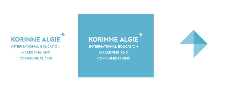
Logo variations (left to right): Primary logo, Inverse logo, Key Visual
BRAND COLOURS
Brand or corporate colours help you to communicate your brand identity without any words at all. That said, unless your brand really warrants it, restrict yourself to 2-3 colours. What is your main brand colour? This colour forms the basis of your brand. Now chose 1 – 2 additional colours that compliment and/or contrast your main colour. Personally, I always like to have a third colour to play with. This gives you options when presenting your brand and allows you to create a more interesting visual. Let’s look at my own brand as an example. I have a main brand colour – turquoise blue. In addition to that, I use two other colours: a darker variation of the same blue tone and a bright pink. I use the darker turquoise tone when I want to look more serious or formal. The pink on the other hand is an attention grabber – I use it whenever I need to stand out.

TYPOGRAPHY
Typography, according to google is the “style and appearance of printed matter” but really it is just a fancy name for your font and how it is used. Does your brand have a font? Yes? Do you know what it is? Does everyone on staff use this font?
Your brand font is a vehicle for the image that you have chosen for your brand. In other words, your font should be a stand-alone reflection of your brand. However, it must also compliment the other elements of your design. How does this font look when combined with your logo? Company colours? Images?
In addition to your primary font, you should choose at least one other font to be used. You might want to use your primary font for headings, titles and in advertising, but you will not likely use it for paragraphs of text on your website or in your brochure. Find a font that compliments or contrasts your main font. No idea how to do this? Not to worry, there are heaps of online resources that can help you work this out, like Canva’s Ultimate Guide to Font Pairing.
Now that you have your fonts, how will you use them?
Will your primary font be in capital letters for headlines? What about subheadings? Using bold or all capital letters appears “louder” to your audience, whereas a lighter font is more elegant. How you use your font for headings depends on what you would like to communicate about your brand and your content.
Something that is often forgotten is headline spacing. How much space do you want between the headline, subheading and the text? Make use of the space you have – allowing for whitespace makes your designs look professional, elegant and deliberate. However, make sure that your content is easy to read and connected.
IMAGE LANGUAGE
As that old saying goes, “a picture is worth a thousand words”. However, if you intend to use images in your marketing, it is important to also have a clear idea of what those 1000 words should be. When talking about images there are two key aspects to consider; how the image is presented and the actual image content.
Image Presentation
When looking at image presentation you must think about things like whether you will cut images on a certain angle, use a filter and if yes, which? Will you use a certain colour scheme in your images or to frame text? To give you another personal example, I always try to include elements of my brand colours in my imagery (take a look at my pink jacket in action). By doing this I am ensuring that my brand is reinforced, and that people think of KAIE Marketing whenever they see my colours.

Image Content
There are literally trillions of images that you could use in your marketing. Regardless of whether you produce your own images or buy stock photographs/illustrations, it is a great idea to set some rules. For example, if you use images depicting people, how should they look eg. relaxed, formal, serious etc? What about a dress code? Should they all be in a certain position or environment? What about their mood or facial expression? Ultimately, all of your images should be shot and/or edited in a way that is easily recognisable and underlines your brand message.

ILLUSTRATIONS / ICONS
In the last decade illustrations have become more and more popular. Visit any website these days and you are almost guaranteed to find some kind of illustrated icon. Illustrations can serve many purposes. You can have technical illustrations to explain a product or process, or illustrations to help create an emotion or encourage a response from your audience. The bottom line on illustrations is that before you jump in, you must think about where you want to use them, for which purpose, and how often. Your illustrations must transfer your brand identity to your audience, as well as communicating their intended purpose.
FINAL THOUGHTS...

Branding is important. And although haphazard use of logos, colours and so on may have worked 10 years ago, it certainly does not work now. Having a clear understanding of your organisation’s identity is the foundation of building a strong brand. Building a brand isn’t just about slapping on a logo. A strong brand has deliberate design and image choices behind it. Most of all, a strong brand is consistent, accurately reflects the institution it is attached to, and sparks an emotional response in the target audience. With a bit of thought and commitment, building a strong brand is absolutely possible.
To speak to me about your brand, or any other aspect of international education marketing, email me at k.algie@korinnealgie.com or via the contact form.
Write a comment